Whether you are building a design for print or web or creating a data visualization, selecting fonts and following basic rules of the road for typography are critical.
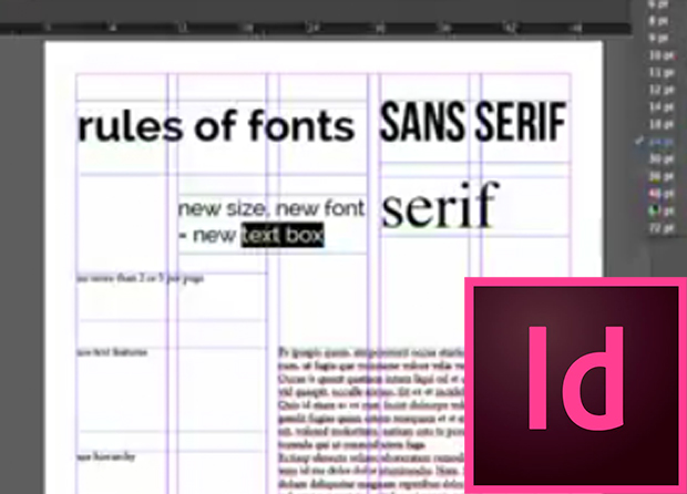
- If you use a new size or a new font, create a new text box. This will prevent you from having odd spacing missteps in your design.
- Keep fonts to 2-3 per page and only use one specialty per page.
- Use text features (bold, italics, etc) to help reader move through content and discern important information
- Use hierarchy. As you move down the page, fonts should get smaller and less bold
- If you are unsure about how to combine typography, stick with one family.
Table of Contents:
00:11 – Downloading from dafont.com
01:05 – Installing in STF
01:34 – Rules for using
01:51 – Sans serif vs serif
02:26 – Never use defaults
02:44 – New font, new size, new text box
03:14 – Limit your fonts
03:24 – Use text features to divide content, help reader
03:37 – Drop caps
03:45 – Subheads
03:50 – Bullets
04:11 – Using hierarchy
04:30 – How to determine what size font to use
05:08 – How to select, use type families
05:41 – Limit specialty fonts
