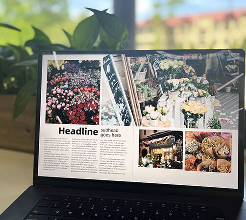
Using grids is the basis of good design. They help create balance and align content.
As a designer places content, using grids focuses them and allows them to more easily place content. Grids can create consistency across a design and across multiple pages of design.
Using grids helps divide content and create order. Grids can help divide content and establish eyelines for a viewer to move across the page or pages.
In this video, I look at how to set up grids (before and after setup and on parent pages). I also show you how to design for a variety of grids.
00:00 Grids Revisited
00:26 Why use grids
01:13 How you set your grids up
02:23 What do we mean by breaking the grid?
03:07 Breaking text into columns
03:31 2 column example
04:09 3 column example
04:54 4 column example
05:19 Takeaways from examples
05:39 Double page spread
06:19 Creating horizontal eyelines
07:21 Consider hierarchy
07:44 Levels of spacing
08:30 Watch for text in the gutter
09:57 Adding space to outside
